Back in 2002 I did an edition of Donne for Wordsworth Classics, wrapping Introduction and Notes round a slightly modified Grierson text. They paid me a three figure sum as a one off, and it was published with a tasteful cover, the Lothian portrait made into a black oval, against a background of brown laid paper.
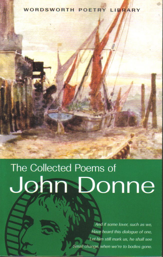
Well, it retails at £3.99 still, and I imagine my students like that price, and are mildly interested by having the editor in their midst. So I order it in to the campus bookshop each year. But look at it now! A late 19th century painting of the Thames side at Southwark at the top, and rising from below, the face of William Wordsworth, backed by the suggestion of a Byzantine halo.
What the image says to me first of all is "stuck in the mud". A blurry and tepid watercolour has been selected for a poet who was all about precision and passion. Was it left over from materials gathered for a cover design on a Dickens novel? And since when has Wordsworth become the official face of poetry?
Does it speak an attitude of "It's just poetry, innit? Wishy-washy stuff, all the same, dont'cha know?" or "This is the corporate design we have adopted after due process of consulting ourselves"?
Actually, this botched job makes the edition look ignorant about the who, when and whatness of John Donne, and so will not help sell the book to its primary promoters, teachers with students to instruct. So a futile editorial raspberry to Robert Mathias at the 'Publishing Workshop'.
I took the cheque, I cashed the cheque. Just leave it, Roy.

2 comments:
On the bright side the colour scheme is at least tasteful. They could have used gaudy colours or pastels... I'm not helping am I...
"And colour is decayed: summer's robe growes
Duskie, and like an oft-dyed garment shows."
(First Anniversary, 355-6)
~ Donne apparently asserting that colours are simply not as good as they once were. So I guess he'd have been even harder to please than his editor.
Post a Comment